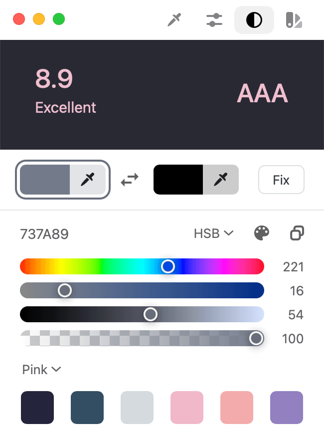
Color Contrast
The contrast checker lets you check the readable accessibility of two colors according to the WCAG 2.0 guidelines.
How to check color contrast
Start by clicking on the contrast tab in ColorSlurp:

Click on the foreground or background color well to edit the colors. You can also click on the magnifier icon in each well to choose a color on your screen.

Clicking the arrows in the middle will swap the foreground and background color.
What does the contrast rating mean?
ColorSlurp shows two values, the contrast ratio, and the WCAG rating. The contrast ratio is a number that goes from 0 to 21. 21 is the best possible contrast ratio (black and white). Zero is bad, really bad.
The rating is created based on the contrast ratio. Here's a quick reference:
- Fail The contrast ratio is not sufficient. There needs to have more contrast.
- AA+ Also called AA Large. Acceptable contrast for type sizes of 18pt and larger.
- AA Good contrast for any text size. This is usually the rating to strive for.
- AAA Enhanced contrast score.
Text that is part of a logo or brand name has no minimum contrast requirement.
You can read more about the WCAG guidelines here.